Posts

Showing posts from July, 2020

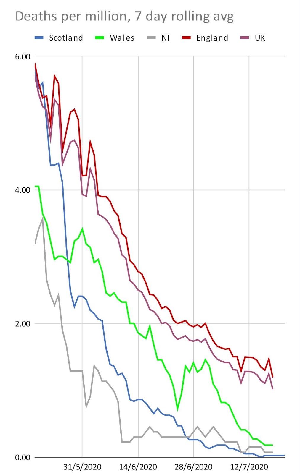
UK policy was to allow 1,000 new cases per day

Image
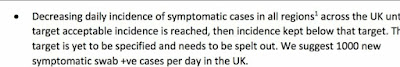
As documented in the  Joint Biosecurity Centre Note on Joint Biosecurity Centre and potential flows, 20 May 2020 It has obviously been policy to tolerate a level of New Cases. Now we know that level was 15 new cases per day, per million people, if a UK figure, or 18 cases a day if it was a figure for England We also can see from the graphs that policies were altered to allow the case rate to start rising again - when the UK new case rate hit 15 per day

"Ah, but what about Belgium?"

Image
Belgium only produced a set of figures where all care home deaths were presumed to be Covid-related To compare like-for-like, this equates most closely to the UK Excess deaths figures. So I have added the "Belgium scale" to the comparison of Covid Deaths per million people across European nations  As before, the X-axis is not meaningful - the datapoints are spread out only to prevent the labels from overlapping

European Nations compared, 6th July

Image
Confirmed deaths per million people Please note, the X-axis is not meaningful - the datapoints are spread to make room for the label text

Population densities, Greater London & Greater Glasgow

A claim often made is that it is not possible to compare Scotland and England because London has a much denser population London;s populationi s larger, and it's population denisty is higher, but not incomparably. Population Area (sq km) Population Density Year Greater Glasgow 1,209,143 368.5 3,281 2011 Greater London 8,908,000 1,572 5,667 2018 Greater London 8,982,000 1,572 5,714 2019 It's worth noting that the City of Glasgow on its own had 1.089 million inhabitants last century, and there has been a concerted effort to lower Glasgow's population density, decade after decade. It's also interesting to note that the City of London only has 8,910 residents. (I used to be one of them.  It was the shortest commute I ever had).  But over 1 million poeople work there each weekday.

Home Nations & UK, Daily confirmed deaths, as at 26th July

Image

Home Nations new cases, compared to Norway

Image
Norway has been held up as having one of the best pandemic outcomes Until Scotland came out of lockdown, we had reached the Norwegian level of Covid suppression

Deaths, comparing Home Nations to New York state, mid-July

Image

New Cases - UK & Home Nations, compared to NY state & Florida , mid-July

Image

24th July, Scotland, New cases & Deaths, per million

Image

UK Government new cases data-series for England, compared with other available data

Image

24th July, Home Nations, Cumulative Deaths per million

Image

24th July, UK + Home Nations, Deaths/million

Image

24th July UK + Home Nations, New cases/million

Image

Home Nations daily confirmed deaths, current (15th July 2020)

Image

Wales daily deaths statistics have been smoothed out

Image
I'm assuming, the statistics have been smoothed out to reflect the day of occurence, rather than the day of reporting The curve for Wales (which changes from red to green between the two graphs) becomes fromt loaded, and no longer is stepped at weekends.

Scotland reaches 0 confirmed deaths in a week

Image
Deaths confirmed by positive test result have reached a 7-day rolling average of zero This is a major milestone Today, the more complete statistics for an earlier period were announced. In the week ending 7th July, there were 14 deaths where Covid was mentioned on the death certificate. I hope that this time next week, we may have zero certified deaths in this period, to match the the zero confirmed deaths.  However, time alone will tell.

Florida, by comparison

Image
Florida released its lockdown after the peak of its first wave had passed. It's now in the midst of a major resurgence Florida is the short line way, way up in the top-right hand corner of the graph

The state of play, 14th July

Image

The starting point

Image
The ONS drew a curve of daily stats, which seemed to show the early stages of an early wave starting around the 9th of June. This graph, along with peartial release of lockdown in England, and consequent media-pressure on teh Scottish Government to release lockdown at that same pace, is what got me started down this warren of rabbitholes.

The first graphs - ONS for England, and Scotland vs rUK

Image
The ONS published England-only numbers, which appeared to show a 2nd wave beginning. And yet, the whole UK "New Cases" numbers published by the Westminster Government showed no rise. This was in the period 20th to 25th June I wanted to know if the whole-UK figures were being used to conceal the England figures. The Westminster Daily Briefing slides were published with a URL, and the URL turned out also to have the datasets in spreadsheet form. Great! But the statistiscs only included Pillar 1 data for Scotland, England & NI.  It did, however, include the total of both Pillar1+Pillar2 data for Wales. This meant that about 45% to 50% of the data was missing. The Scottish Government were announcing the total of Pillar1+Pillar2 each day in their daily briefing. As a first cut, I drew the Scotland data, and subtracted it from the UK data, giving a data-series for the rest of the UK (rUK) data, (and I then calculated the 7 day average, and adju

The Home Nations Covid graphs

Recently, I have become interested in how the Home Nations compare, in terms of Covid outcomes. I was interested to see if the different policies were having noticably different effects. I had assumed, naively, as it turns out, that the actual data would be easy to acquire, and so I could spend a trivial amount of time graphing the data in ways I had not seen published. I was wrong. Now, several weeks later, I am older and somewhat wider.  Or at least more informed. I'm going to try to write a series of blog posts that show my own journey, and leads up to all the latest graphs I am now producing.