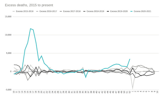
The Home Nations Covid graphs
Recently, I have become interested in how the Home Nations compare, in terms of Covid outcomes.
I was interested to see if the different policies were having noticably different effects.
I had assumed, naively, as it turns out, that the actual data would be easy to acquire, and so I could spend a trivial amount of time graphing the data in ways I had not seen published.
I was wrong.
Now, several weeks later, I am older and somewhat wider. Or at least more informed.
I'm going to try to write a series of blog posts that show my own journey, and leads up to all the latest graphs I am now producing.


Comments
Post a Comment