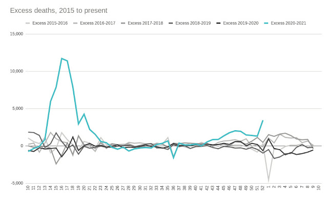
The first graphs - ONS for England, and Scotland vs rUK

The ONS published England-only numbers, which appeared to show a 2nd wave beginning.
And yet, the whole UK "New Cases" numbers published by the Westminster Government showed no rise.
This was in the period 20th to 25th June
I wanted to know if the whole-UK figures were being used to conceal the England figures.
The Westminster Daily Briefing slides were published with a URL, and the URL turned out also to have the datasets in spreadsheet form.
Great!
But the statistiscs only included Pillar 1 data for Scotland, England & NI. It did, however, include the total of both Pillar1+Pillar2 data for Wales.
This meant that about 45% to 50% of the data was missing.
The Scottish Government were announcing the total of Pillar1+Pillar2 each day in their daily briefing.
As a first cut, I drew the Scotland data, and subtracted it from the UK data, giving a data-series for the rest of the UK (rUK) data, (and I then calculated the 7 day average, and adjusted for population)

It didn't show a 2nd wave for the rUK, but it did show a substantial difference in rates between Scotland and the rUK. Maybe NI - with its famously low levels of Covid (for a Home Nation, at any rate) - and Wales were dropping quickly enough to counteract a slight 2nd wave in England?
Maybe the ONS was right, and their graph with an uptick at the end really did show a "levelling off", after all.
Then the ONS updated their graph. Still labelled as showing a "levelling off". But it seemed, to me, to confirm the likelihood of the early stages of exponential growth.


Comments
Post a Comment